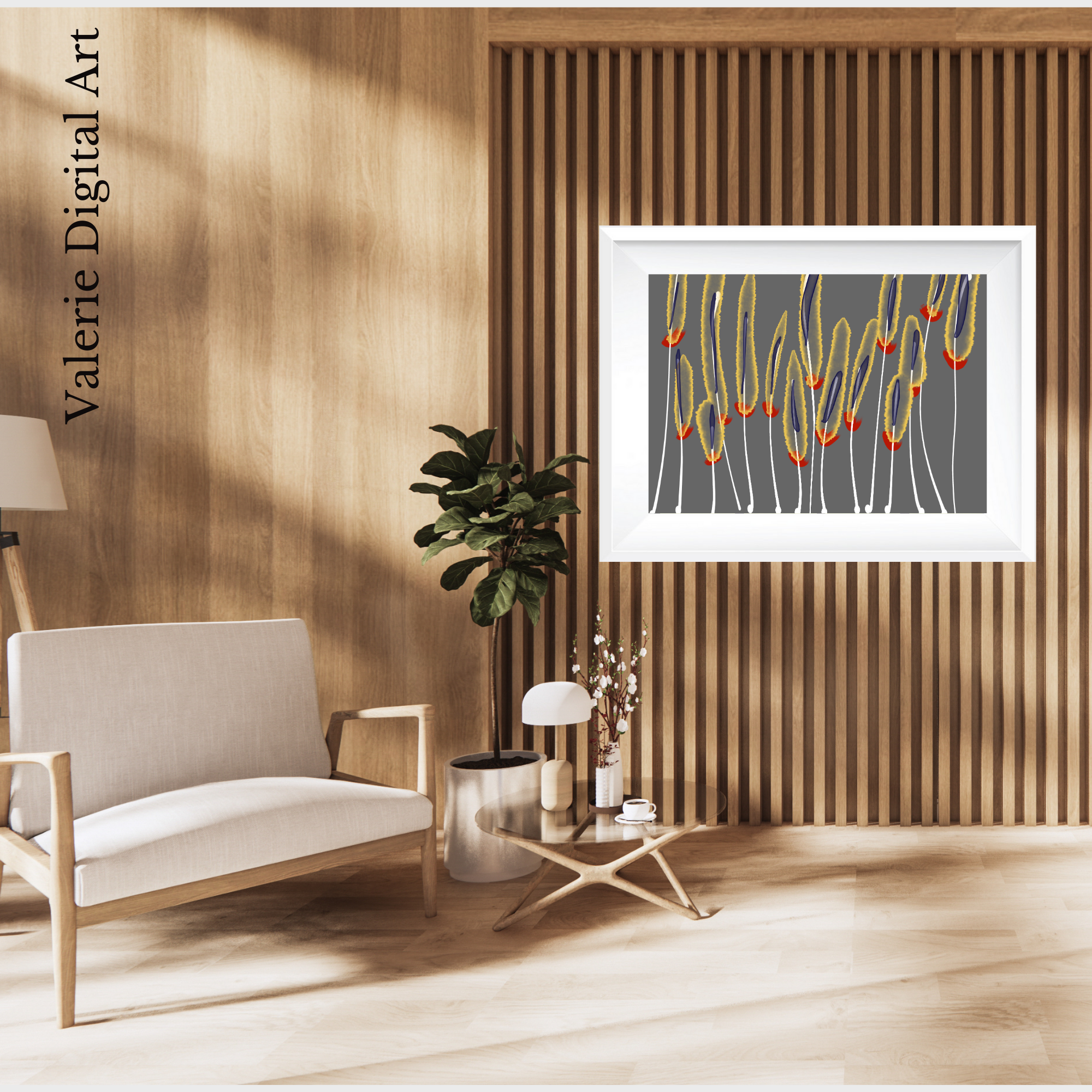
Discover the magic of my art.
It's all authentic and unlike anything else!
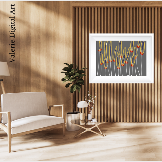
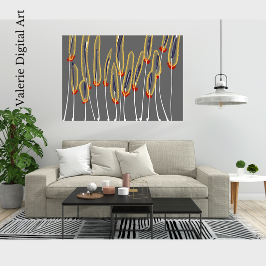
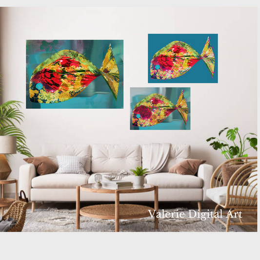
FURNISH YOUR HOME WITH CLASS

NEW COLLECTIONS 2024
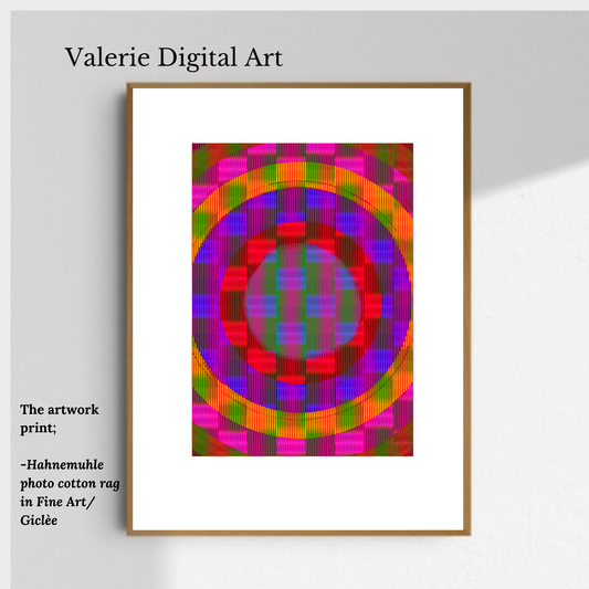
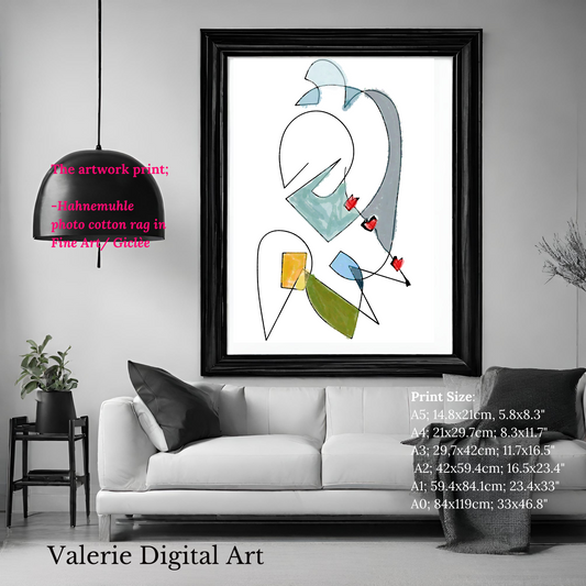
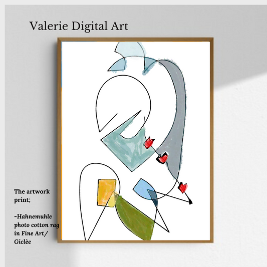
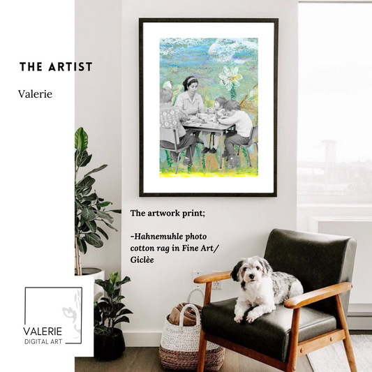
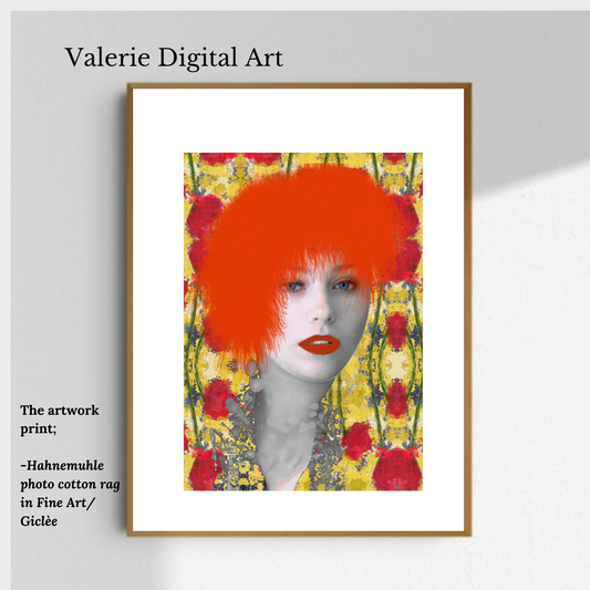
VALERIE DIGITAL ART Present her new collection in fine art. Discover the latest masterpiece by Valerie Digital Art as she unveils her new collection in the world of fine art.
-
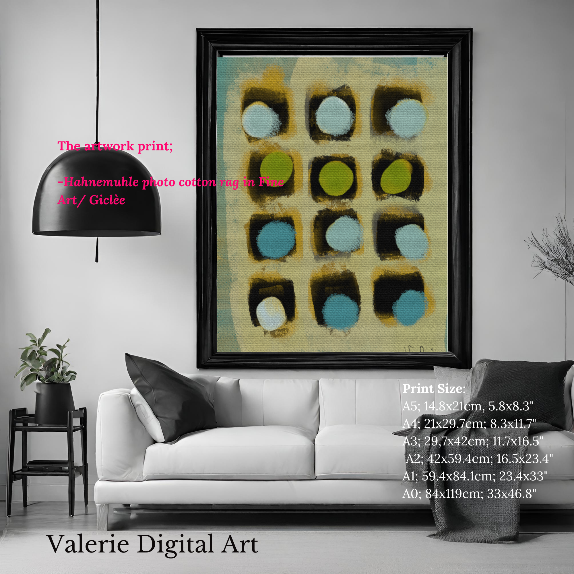
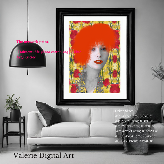
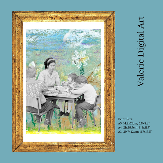
Eye catching Hahnemühle Photo Rag Print
Regular price From €48,99 EURRegular priceUnit price per -
The Flower Prade Hahnemühle Photo Rag Print
Regular price From €48,99 EURRegular priceUnit price per -
Connected pieces Hahnemühle Photo Rag Print
Regular price From €48,00 EURRegular priceUnit price per -
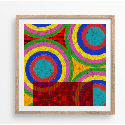
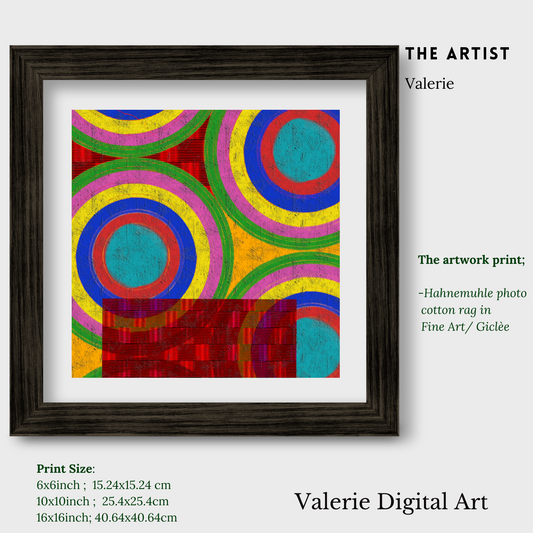
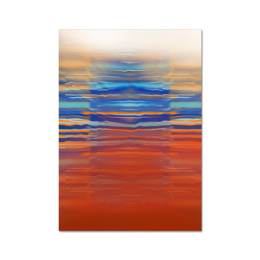
Glitch A Hahnemühle Photo Rag Print
Regular price From €46,99 EURRegular priceUnit price per -
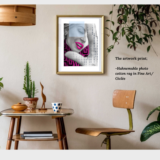
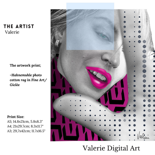
Paparazzi Hahnemühle Photo Rag Print
Regular price From €45,99 EURRegular priceUnit price per -
Glitch B Hahnemühle Photo Rag Print
Regular price From €46,99 EURRegular priceUnit price per -
Not meaningful lines green Hahnemühle Photo Rag Print
Regular price From €46,99 EURRegular priceUnit price per -
Not meaningful lines Hahnemühle Photo Rag Print
Regular price From €30,00 EURRegular priceUnit price per -
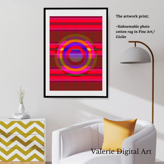
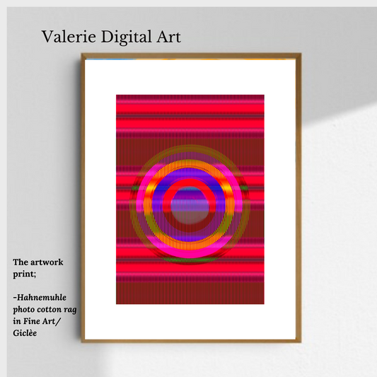
The Aim Hahnemühle Photo Rag Print
Regular price From €29,99 EURRegular priceUnit price per -
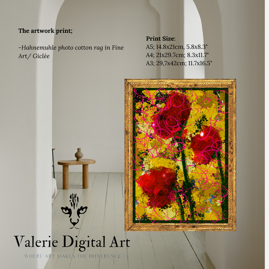
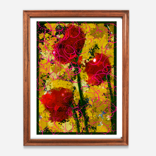
THE ROSES in fine art
Regular price From €43,99 EURRegular priceUnit price per -
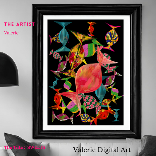
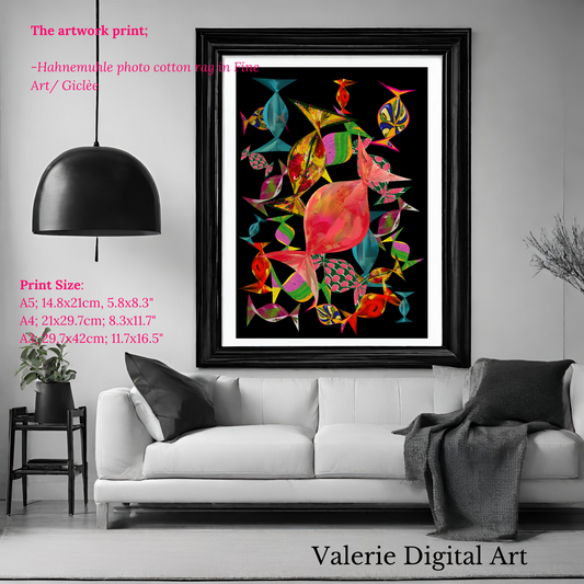
SWEETS in fine art
Regular price From €43,99 EURRegular priceUnit price per -
The Teacher Hahnemühle Photo Rag Print
Regular price From €43,99 EURRegular priceUnit price per
-
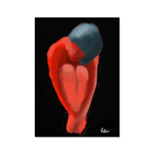
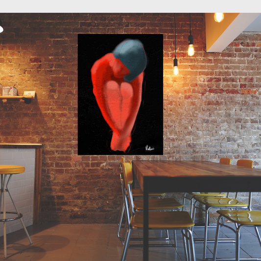
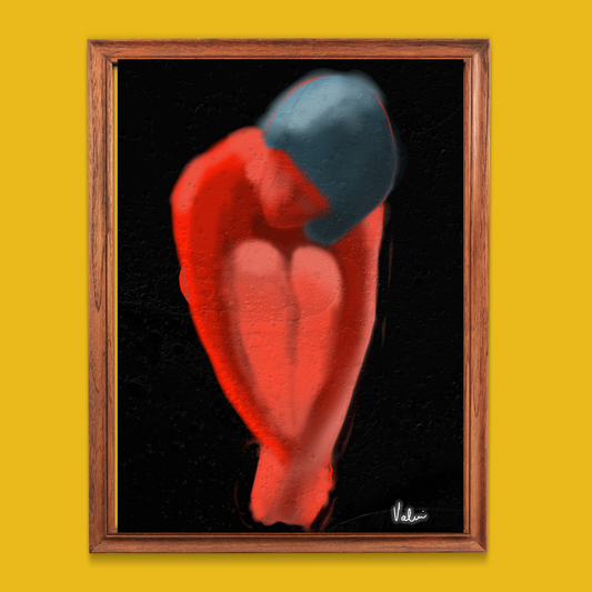
SHAMED in Fine Art prints
Regular price From €43,99 EURRegular priceUnit price per -
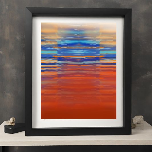
SUNSET GLITCH in fine art
Regular price From €46,99 EURRegular priceUnit price per -
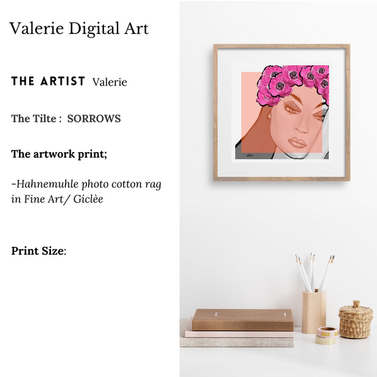
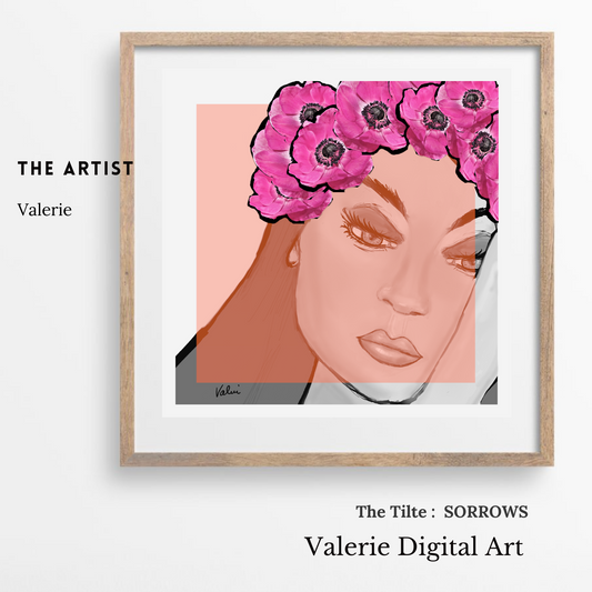
Sorrows in Fine Art
Regular price From €114,00 EURRegular priceUnit price per -
Meadows Hahnemühle Photo Rag Print
Regular price From €39,99 EURRegular priceUnit price per -
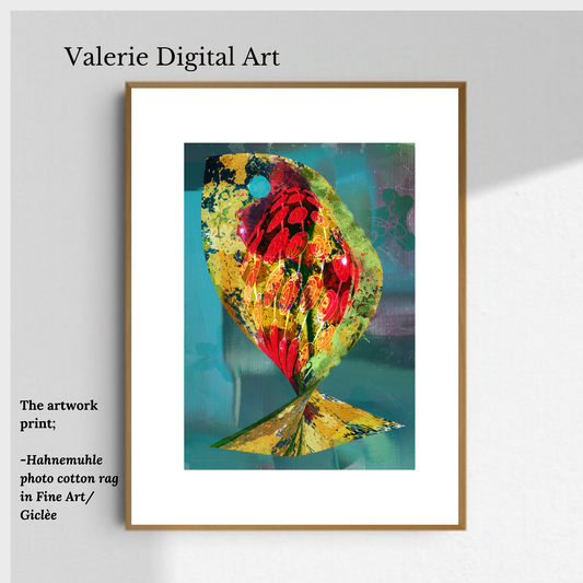
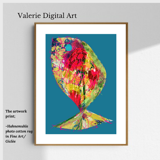
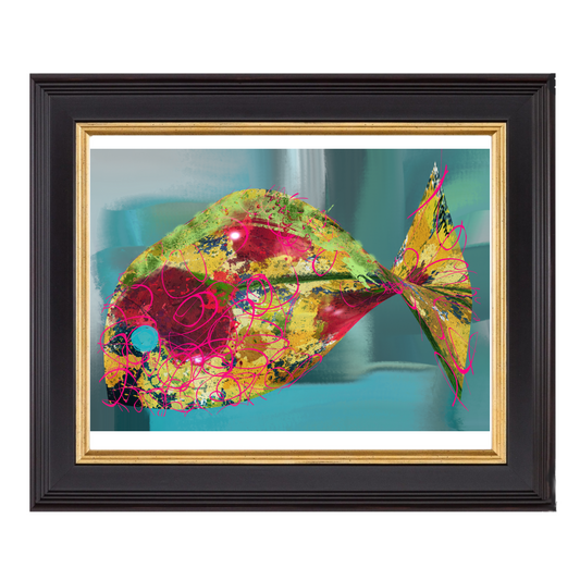
Fish 3 Hahnemühle Photo Rag Print
Regular price From €48,00 EURRegular priceUnit price per -
Fish 2 Hahnemühle Photo Rag Print
Regular price From €48,00 EURRegular priceUnit price per -
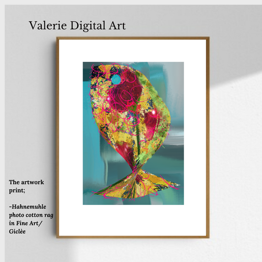
Fish 1 Hahnemühle Photo Rag Print
Regular price From €52,27 EURRegular priceUnit price per -
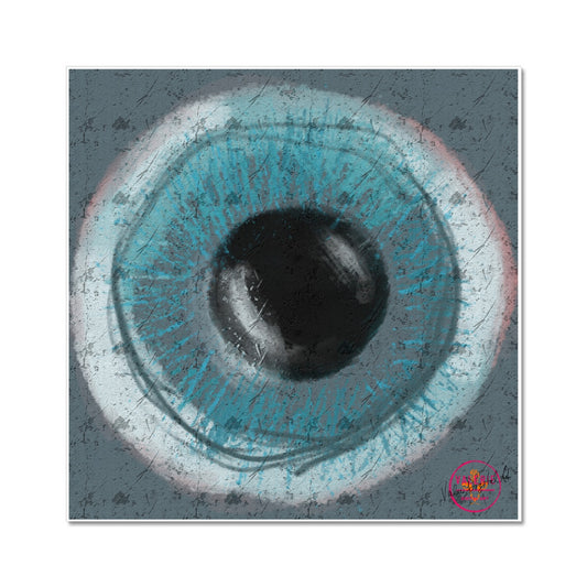
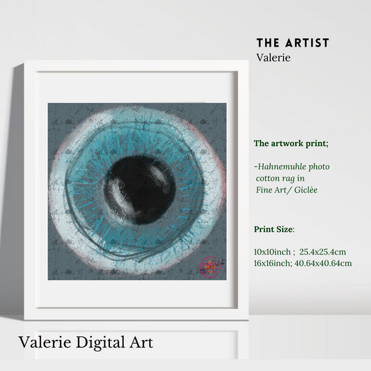
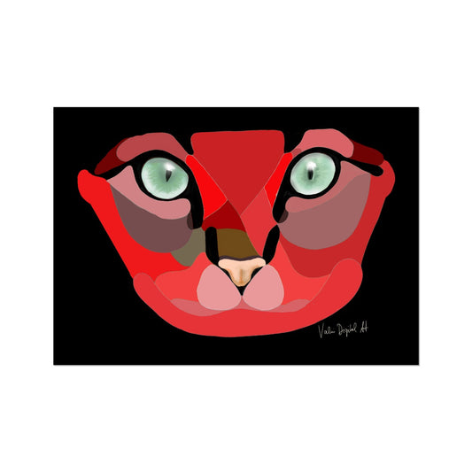
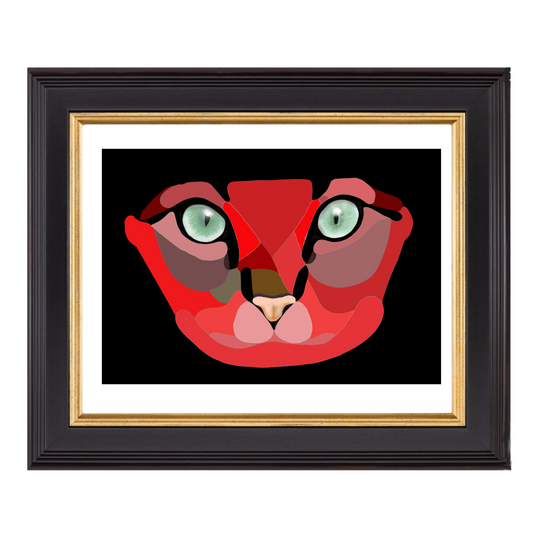
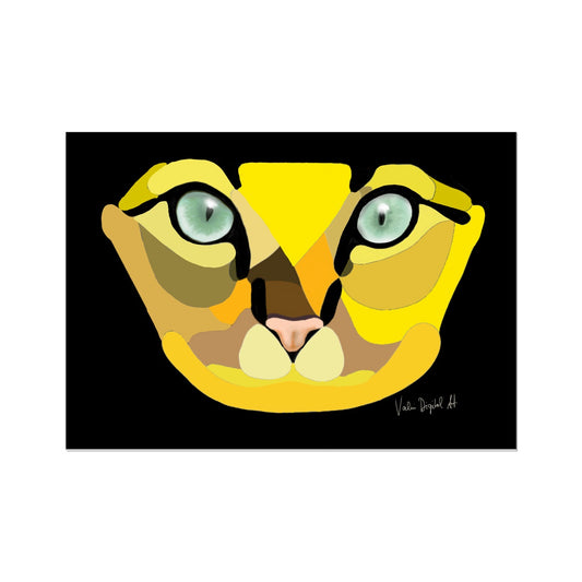
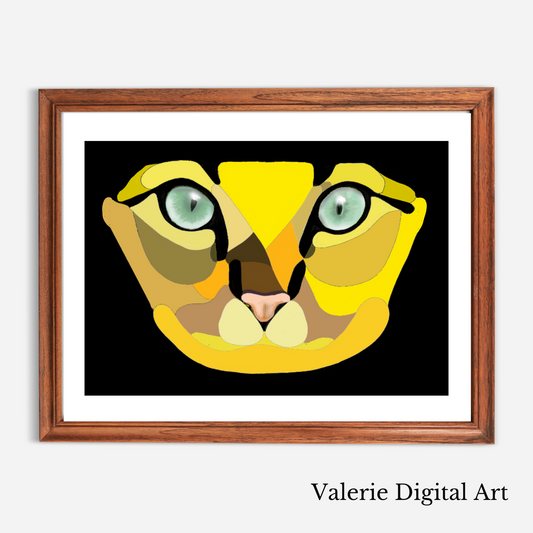
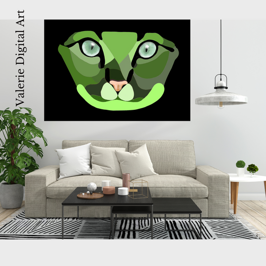
Eye of the cat Hahnemühle Photo Rag Print
Regular price From €46,99 EURRegular priceUnit price per

The wonders that art can do in your home

ANIMAL COLLECTION
Original and unique prints
-
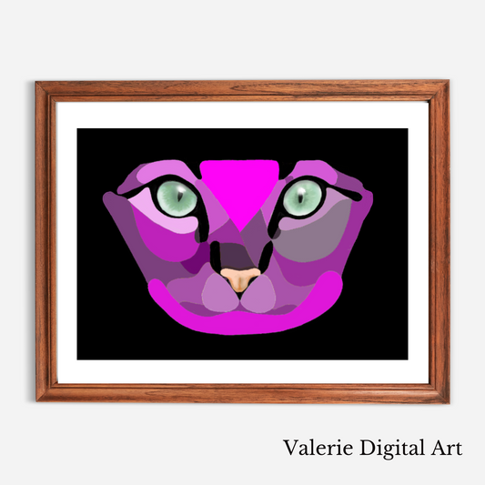
PLURPLE MICCI MY CAT Hahnemühle large Photo Rag Print
Regular price From €133,06 EURRegular priceUnit price per -
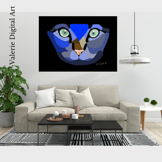
Blue Micci Hahnemühle Photo Rag Print
Regular price From €133,06 EURRegular priceUnit price per -
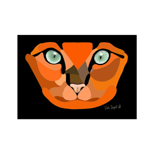
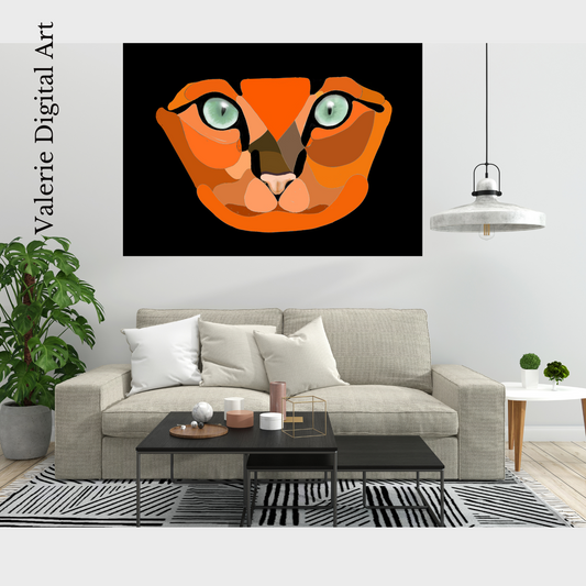
Orange MICCI MY CAT Hahnemühle large Photo Rag Print
Regular price From €133,06 EURRegular priceUnit price per -
RED MICCI MY CAT Hahnemühle large Photo Rag Print
Regular price From €133,06 EURRegular priceUnit price per -
Yellow Micci Hahnemühle large Photo Rag Print
Regular price From €133,06 EURRegular priceUnit price per -
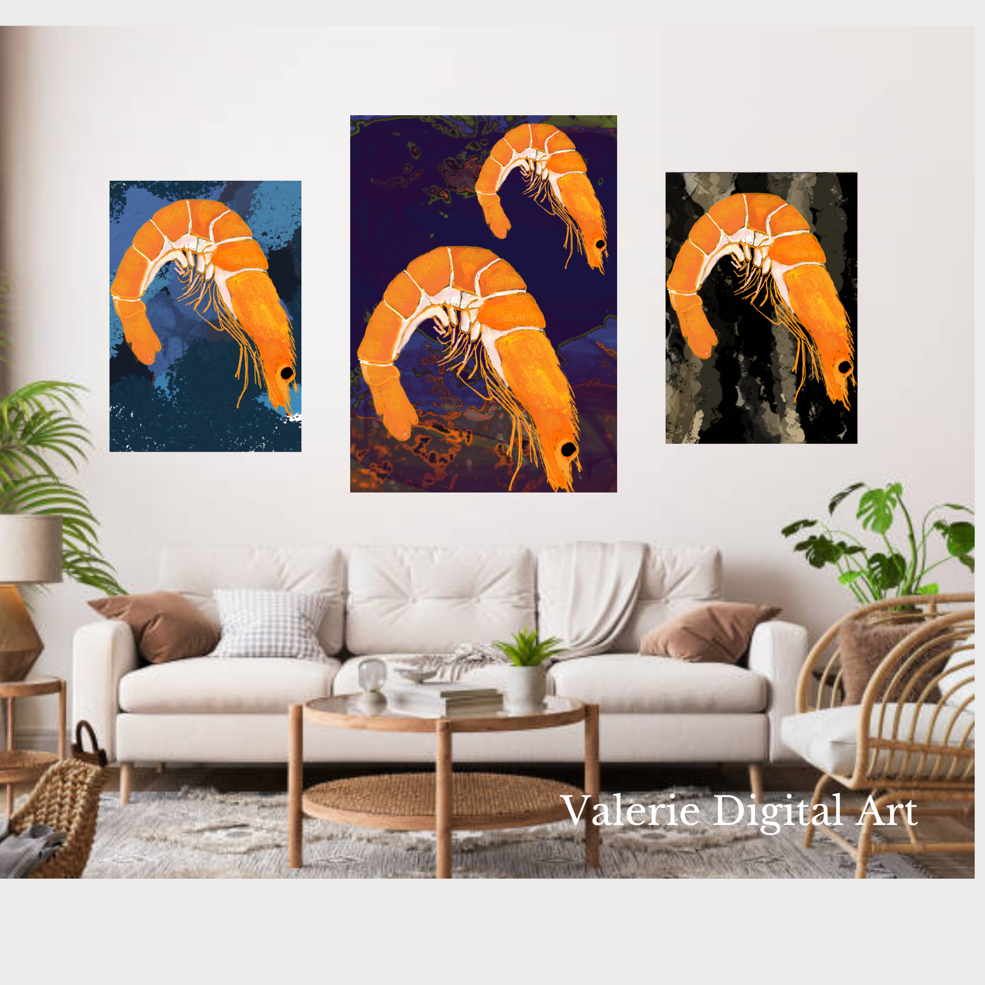
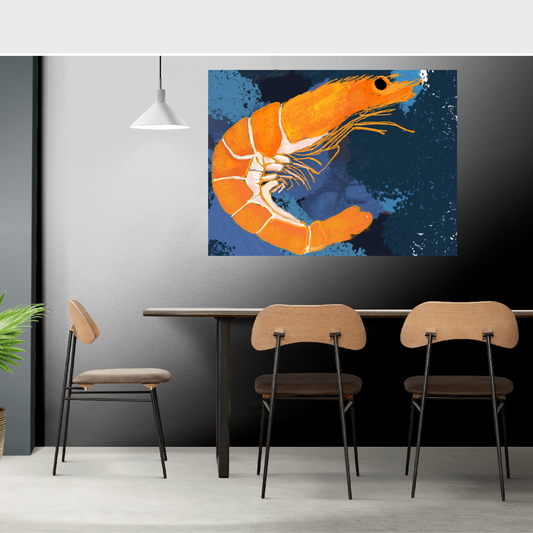
PRAWN IN DEEP SEA Hahnemühle German Etching Print
Regular price From €69,48 EURRegular priceUnit price per -
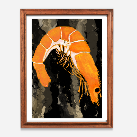
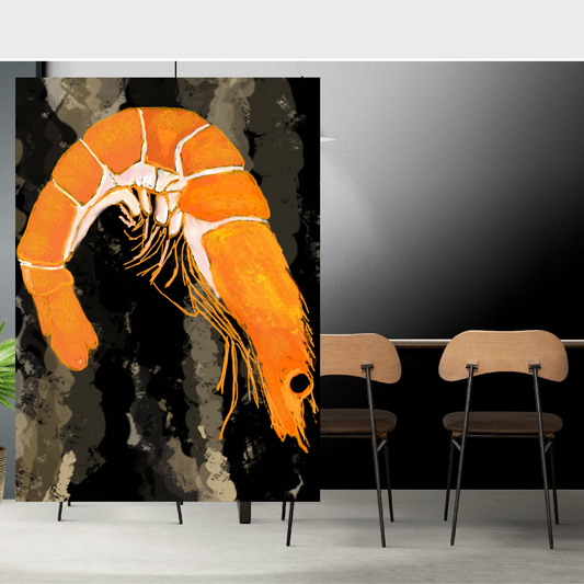
MUDDY PRAWN Hahnemühle German Etching Print
Regular price From €69,48 EURRegular priceUnit price per -
Fish 3 Hahnemühle Photo Rag Print
Regular price From €48,00 EURRegular priceUnit price per -
Fish 2 Hahnemühle Photo Rag Print
Regular price From €48,00 EURRegular priceUnit price per -
Fish 1 Hahnemühle Photo Rag Print
Regular price From €52,27 EURRegular priceUnit price per -
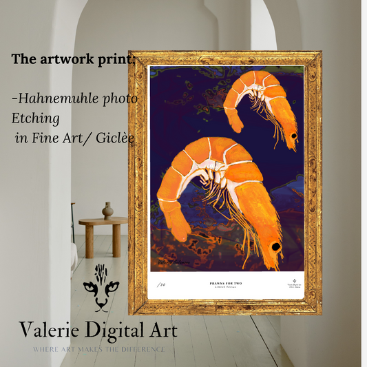
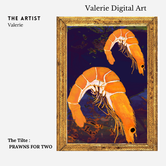
PRAWNS FOR TWO Hahnemühle German Etching Print
Regular price From €69,48 EURRegular priceUnit price per -
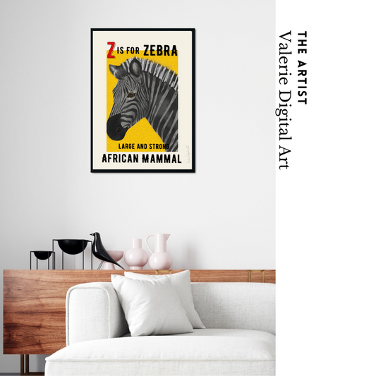
Z IS FOR ZEBRA - in fine art
Regular price €110,00 EURRegular priceUnit price per


Fine Art
-
PLURPLE MICCI MY CAT Hahnemühle large Photo Rag Print
Regular price From €133,06 EURRegular priceUnit price per -
Green Micci Hahnemühle large Photo Rag Print
Regular price From €133,06 EURRegular priceUnit price per -
Blue Micci Hahnemühle Photo Rag Print
Regular price From €133,06 EURRegular priceUnit price per -
Orange MICCI MY CAT Hahnemühle large Photo Rag Print
Regular price From €133,06 EURRegular priceUnit price per -
RED MICCI MY CAT Hahnemühle large Photo Rag Print
Regular price From €133,06 EURRegular priceUnit price per -
Yellow Micci Hahnemühle large Photo Rag Print
Regular price From €133,06 EURRegular priceUnit price per -
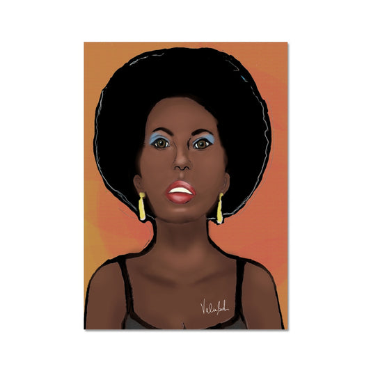
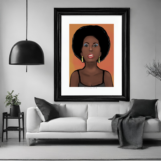
70's Soul Sister Hahnemühle Photo Rag Print
Regular price From €32,99 EURRegular priceUnit price per -
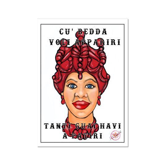
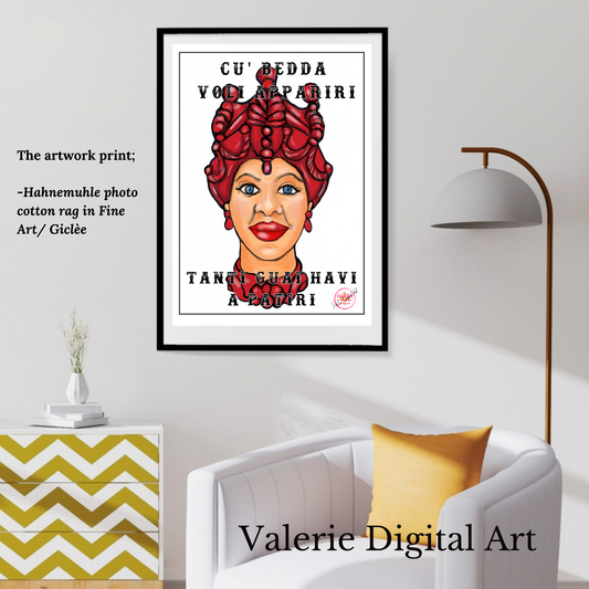
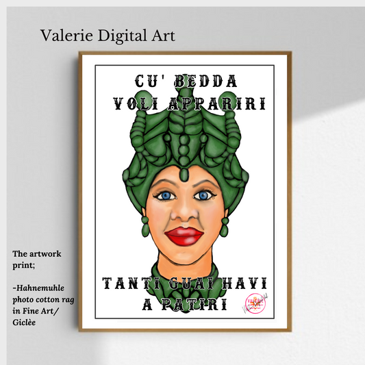
BEDDA RED Hahnemühle Photo Rag Print
Regular price €65,00 EURRegular priceUnit price per -
BEDDA SANTUZZA Hahnemühle Photo Rag Print
Regular price €65,00 EURRegular priceUnit price per -
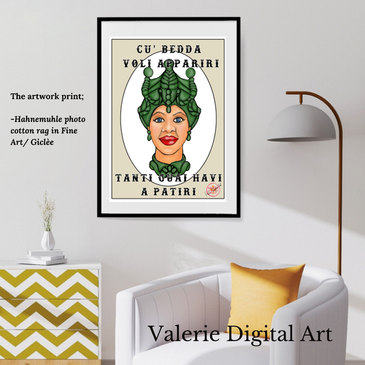
BEDDA GREEN Hahnemühle Photo Rag Print
Regular price €65,00 EURRegular priceUnit price per -
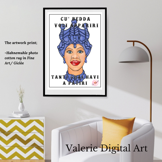
BEDDA Blue Hahnemühle Photo Rag Print
Regular price €65,00 EURRegular priceUnit price per -
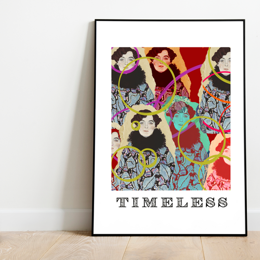
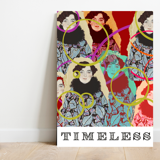
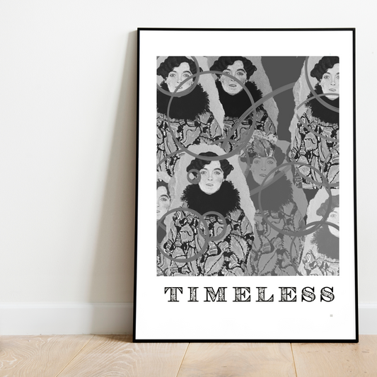
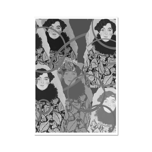
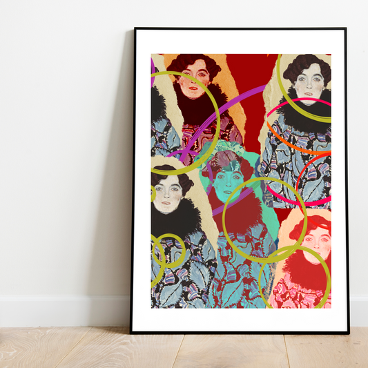
TIMELESS KLIMT (C) Hahnemühle Photo Rag Print
Regular price From €66,53 EURRegular priceUnit price per


Wall Art complements your home


All Artwork
-
PLURPLE MICCI MY CAT Hahnemühle large Photo Rag Print
Regular price From €133,06 EURRegular priceUnit price per -
Green Micci Hahnemühle large Photo Rag Print
Regular price From €133,06 EURRegular priceUnit price per -
Blue Micci Hahnemühle Photo Rag Print
Regular price From €133,06 EURRegular priceUnit price per -
Orange MICCI MY CAT Hahnemühle large Photo Rag Print
Regular price From €133,06 EURRegular priceUnit price per -
RED MICCI MY CAT Hahnemühle large Photo Rag Print
Regular price From €133,06 EURRegular priceUnit price per -
Yellow Micci Hahnemühle large Photo Rag Print
Regular price From €133,06 EURRegular priceUnit price per -
70's Soul Sister Hahnemühle Photo Rag Print
Regular price From €32,99 EURRegular priceUnit price per -
BEDDA RED Hahnemühle Photo Rag Print
Regular price €65,00 EURRegular priceUnit price per -
BEDDA SANTUZZA Hahnemühle Photo Rag Print
Regular price €65,00 EURRegular priceUnit price per -
BEDDA GREEN Hahnemühle Photo Rag Print
Regular price €65,00 EURRegular priceUnit price per -
BEDDA Blue Hahnemühle Photo Rag Print
Regular price €65,00 EURRegular priceUnit price per -
TIMELESS KLIMT (C) Hahnemühle Photo Rag Print
Regular price From €66,53 EURRegular priceUnit price per
SICILIAN COLLECTION
-
BEDDA RED Hahnemühle Photo Rag Print
Regular price €65,00 EURRegular priceUnit price per -
BEDDA SANTUZZA Hahnemühle Photo Rag Print
Regular price €65,00 EURRegular priceUnit price per -
BEDDA GREEN Hahnemühle Photo Rag Print
Regular price €65,00 EURRegular priceUnit price per -
BEDDA Blue Hahnemühle Photo Rag Print
Regular price €65,00 EURRegular priceUnit price per -
●THE SICILIAN COLLECTION TOTE BAGS SHOPPERS
Regular price €19,00 EURRegular priceUnit price per -
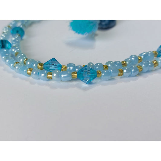
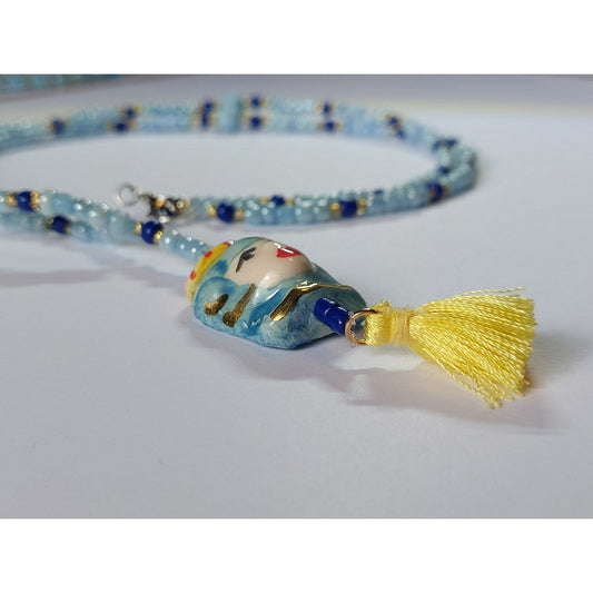
Sicilian style 48cm beaded necklace with ceramic charm
Regular price €37,00 EURRegular priceUnit price per -
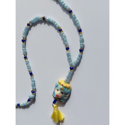
Sicilian style 45cm necklace with ceramic charm
Regular price €35,00 EURRegular priceUnit price per -
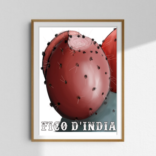
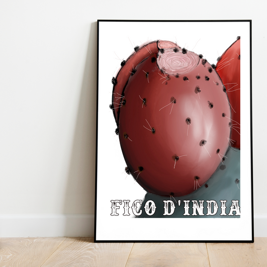
●FICO D'INDIA TOTE BAGS SHOPPERS
Regular price €19,00 EURRegular priceUnit price per -
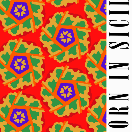
●BORN IN SICILY TOTE BAGS SHOPPERS
Regular price €19,00 EURRegular priceUnit price per -
FICO D'INDIA -Sicilian Collection
Regular price From €37,99 EURRegular priceUnit price per€49,99 EURSale price From €37,99 EURSale


PORTRAIT COLLECTIONS
-
TIMELESS KLIMT (C) Hahnemühle Photo Rag Print
Regular price From €66,53 EURRegular priceUnit price per -
B&W TIMLESS KLIMT Hahnemühle Photo Rag Print
Regular price From €66,53 EURRegular priceUnit price per -
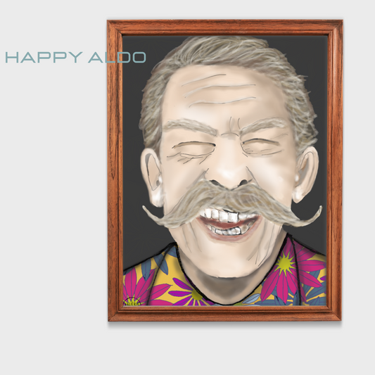
HAPPY ALDO - Canvas print
Regular price From €66,99 EURRegular priceUnit price per -
70's Soul Sister Hahnemühle Photo Rag Print
Regular price From €32,99 EURRegular priceUnit price per -
BEDDA RED Hahnemühle Photo Rag Print
Regular price €65,00 EURRegular priceUnit price per -
BEDDA SANTUZZA Hahnemühle Photo Rag Print
Regular price €65,00 EURRegular priceUnit price per -
BEDDA GREEN Hahnemühle Photo Rag Print
Regular price €65,00 EURRegular priceUnit price per -
BEDDA Blue Hahnemühle Photo Rag Print
Regular price €65,00 EURRegular priceUnit price per -
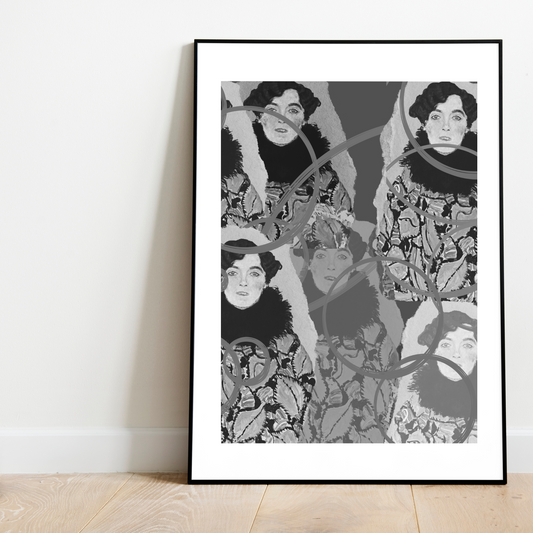
BLACK AND WHITE KLIMT Hahnemühle Photo Rag Print
Regular price From €66,53 EURRegular priceUnit price per -
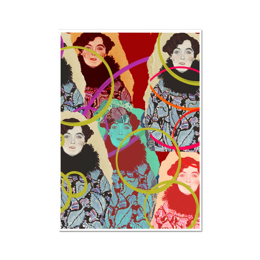
COLOURED KLIMT Hahnemühle Photo Rag Print
Regular price From €66,53 EURRegular priceUnit price per -
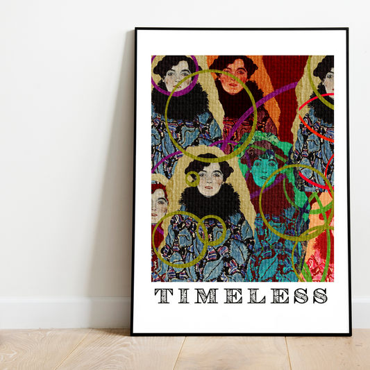
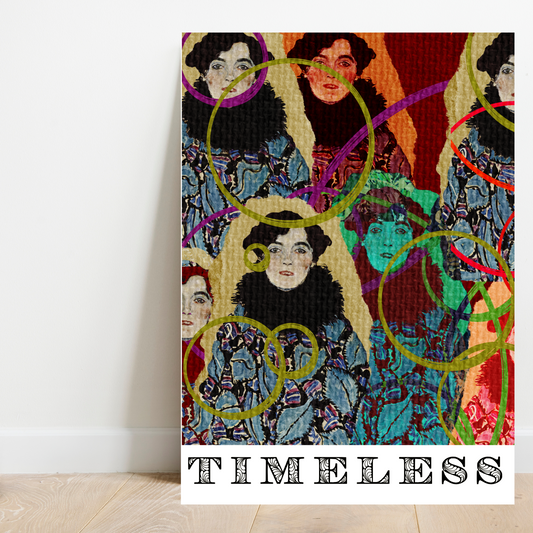
TIMELESS KLIMT Hahnemühle Photo Rag Print
Regular price From €66,53 EURRegular priceUnit price per -
The Flower Prade Hahnemühle Photo Rag Print
Regular price From €48,99 EURRegular priceUnit price per


ABSTRACT COLLECTION
-
B&W TIMLESS KLIMT Hahnemühle Photo Rag Print
Regular price From €66,53 EURRegular priceUnit price per -
PLURPLE MICCI MY CAT Hahnemühle large Photo Rag Print
Regular price From €133,06 EURRegular priceUnit price per -
Green Micci Hahnemühle large Photo Rag Print
Regular price From €133,06 EURRegular priceUnit price per -
Blue Micci Hahnemühle Photo Rag Print
Regular price From €133,06 EURRegular priceUnit price per -
RED MICCI MY CAT Hahnemühle large Photo Rag Print
Regular price From €133,06 EURRegular priceUnit price per -
Yellow Micci Hahnemühle large Photo Rag Print
Regular price From €133,06 EURRegular priceUnit price per -
70's Soul Sister Hahnemühle Photo Rag Print
Regular price From €32,99 EURRegular priceUnit price per -
BEDDA RED Hahnemühle Photo Rag Print
Regular price €65,00 EURRegular priceUnit price per -
BEDDA Blue Hahnemühle Photo Rag Print
Regular price €65,00 EURRegular priceUnit price per -
TIMELESS KLIMT (C) Hahnemühle Photo Rag Print
Regular price From €66,53 EURRegular priceUnit price per -
BLACK AND WHITE KLIMT Hahnemühle Photo Rag Print
Regular price From €66,53 EURRegular priceUnit price per -
COLOURED KLIMT Hahnemühle Photo Rag Print
Regular price From €66,53 EURRegular priceUnit price per


BLOG
View all-
This week, we’ll be discussing the challenges o...
valeria salamoneWelcome back, readers! This week, we’ll be discussing the challenges of opening an online store. As someone who has gone through the process myself, I can attest to the fact...
This week, we’ll be discussing the challenges o...
valeria salamoneWelcome back, readers! This week, we’ll be discussing the challenges of opening an online store. As someone who has gone through the process myself, I can attest to the fact...
-
The Choice of the Month
valeria salamoneIn our latest collection for 2024, we have featured a captivating artwork titled 'Shamed'. This modern abstract piece is specifically created to address the emotions of women who often feel...
The Choice of the Month
valeria salamoneIn our latest collection for 2024, we have featured a captivating artwork titled 'Shamed'. This modern abstract piece is specifically created to address the emotions of women who often feel...
-
New Collection 2024
valeria salamoneMy niche is abstract art. I love creating and exploring different forms of expression through colors, shapes, and textures. Abstract art is one of my two greatest passions, and I...
New Collection 2024
valeria salamoneMy niche is abstract art. I love creating and exploring different forms of expression through colors, shapes, and textures. Abstract art is one of my two greatest passions, and I...


Collapsible content
Free Shipping in Europe
About us
What's my aim
into your home and office and everyday wear.
Ideas also as gifts for every occasions.
who is Valerie Digital Art
Our services
Our services. Our artwork is designed by Valerie from Valerie Digital Art. All designs are original and unique. no designs are generated by AI (artificial intelligence). For printing and shipping, we use third-party companies such as Prodigi. Prodigi is a company that fulfills our standard needs. Valerie Digital Art takes extra interest in the quality of the prints, which are printed in high-quality or fine art print.